Collections
Collections bring related events together in one place so analysts can collaborate, share context, and manage ongoing investigations. They can be thought of as case files or folders of supporting information. Collections support tagging other users, adding comments, and attaching files.
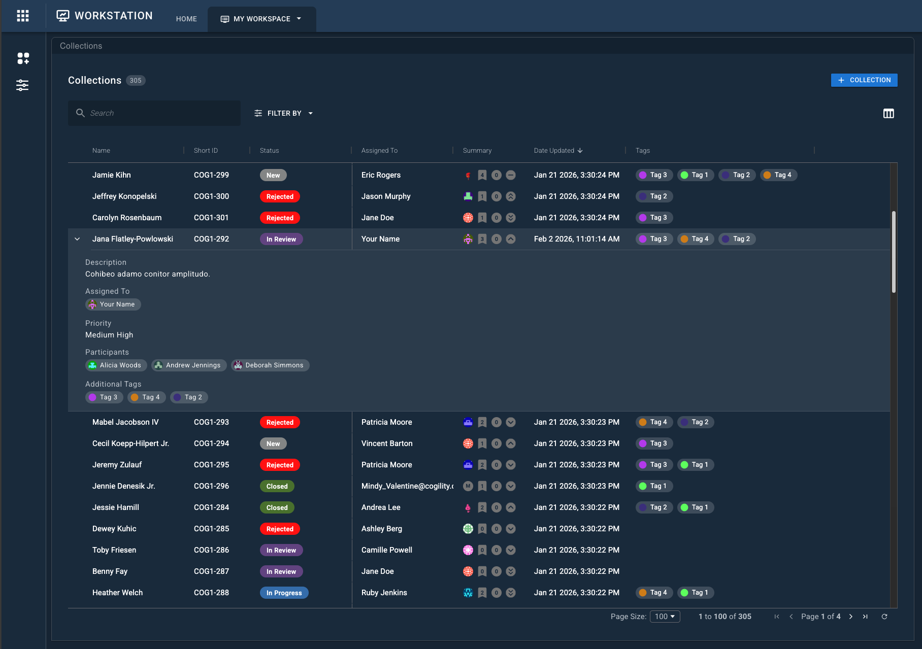
The Collections widget provides a table-based view of collections and allows users to create, search, filter, and manage them within a workspace.
Using the Collections Widget
The Collections widget is typically used as the starting point for case work. Analysts use it to locate or create a collection, then open that collection in an Object Details Viewer to review details, add events, and collaborate.
A common workflow looks like this:
- Use the Collections widget to find an existing collection or create a new one.
- Open a collection by sending it to the Object Details Viewer.
- Perform detailed work inside the Object Details Viewer, such as:
- Reviewing attached events.
- Adding comments or files.
- Updating status, priority, or tags.
- Return to the Collections widget to continue managing or switching between collections.
The Collections widget focuses on discovery and organization, while the Object Details Viewer is where most collection-specific work is performed.
Core Functionality
Detailed usage of the Collections widget is documented in the following sections:
- Creating Collections: The various methods that can be used to create a collection.
- Finding Collections: Searching and filtering for collections.
- Sending Data to the Object Details Viewer: How to view the details of a single collection.
More Row Actions
In the More menu (⋮), users can select from these options:
- Open in New Browser Tab: Opens the selected collection (or event) in a new browser tab.
- Copy Link: Copies a permalink URL of the collection to your clipboard.
- Open in New Viewer Widget: Opens a new Object Details Viewer widget that contains the selected collection's details.
- Send to Viewer Widget: Select from any already opened Object Details Viewer widget.
- Send to Another Workspace: Send to any Object Details Viewer inside of a workspace that the user has access to.
- Archive: Archives the selected collection.
- Export: Exports the selected collection as the selected format.
Table Display Settings
The following section describes controls available to manipulate the display of the table.
Table Columns
At the top right of the widget, click the Columns icon to control which fields are displayed in the Collections table. Select or clear the checkbox next to each field to show or hide it.
| Column | Description |
|---|---|
| Assigned To | The user currently assigned to the collection. |
| Collection ID | The system-generated unique identifier for the collection. |
| Date Created | The date the collection was created. |
| Date Updated | The most recent date the collection was updated. |
| Description | The collection’s description. |
| Name | The name of the collection. |
| Num Items | The number of events added to the collection. |
| Participants | Users listed as participants on the collection. |
| Priority | The priority level assigned to the collection. |
| Short ID | A user-friendly short identifier for the collection, if configured. |
| Status | The current status of the collection. |
| Summary | A set of icons summarizing the assignee, item count, priority, and tags. |
| Tags | Tags currently applied to the collection. |
Pinning Columns
Pinning a column keeps it in place while scrolling through other system field columns.
To pin columns:
- In the Collections widget, locate the column to pin.
- At the top of the column, hover to reveal the pin icon.
- Click the pin icon to pin the column. Click the icon again to unpin the column.
Hiding Columns
Columns can be hidden to focus on other priority data fields, or simply to arrange and personalize a workspace.
To hide columns:
- In the Collections widget, locate the column to hide.
- At the top of the column, hover to reveal the More menu icon (⋮), then click it to open the more menu.
- Select Hide Column to hide the selected column.
- To unhide a column, use the Columns icon to add the unticked/hidden column.
Sorting Columns
Column values can be sorted in either ascending or descending order, affecting the display of columns.
To sort columns:
- In the Collections widget, locate the column to sort.
- Click the column to sort by ascending order.
- Click the column a second time to sort by descending order.
- Click the column a third time to return to default sorting.
Or, use the More menu:
- At the top of the column, hover to reveal the More menu icon (⋮). Click it to open the More menu.
- Select your sort method.
Sorting works on alphanumeric strings, floats, integers, and timestamps.