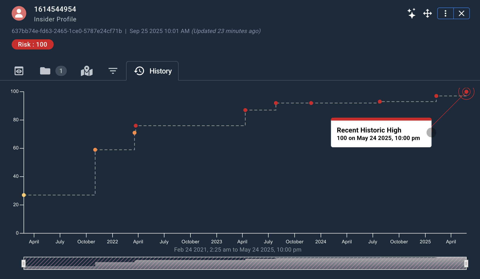
Risk History
The Risk History widget charts an event's risk over time as a line/scatter graph.
Risk History is only available for event types where a Stream Type of CRUD has been configured in Authoring. History is generated only after changes occur to the underlying data.
Once available, Risk History must be ingested separately through the Workstation Data Ingestion screen before it can be viewed in Workstation.
The Risk History widget can always be added to a workspace, but it only displays information for events that have historical data available.
The History tab in an event's Object Details Viewer appears only when history data exists for that event.
Accessing Risk History
To access the Risk History chart for a given event (assuming historical data is available), either:
- View the event on a Detail Viewer and click the History tab.
- Add a Risk History widget to your workspace and drag an event onto it.
The Risk History chart displays:
- Risk level plotted over time.
- The x-axis represents time elapsed.
- The y-axis represents risk updates by date.
- Longer elapsed periods are farther apart, and shorter periods are closer together.
- Multiple risk bubbles can represent events undergoing multiple changes in risk level within a single day.
- All risk points are color-coded. The most severe risks are red, followed by orange, yellow, or gray.
- Hovering over each risk bubble displays a popup menu with a readout of the date and risk level.
Adjusting Risk History Timeframe
Events that contain many changes to risk history will accumulate many datapoints over time. The graph on such events can appear cluttered, so the time bar can be focused to chart risk within a more limited timeframe.
At the bottom of the Risk History widget, the time bar allows you to filter for a specific time period. Drag the left or right sides of the time bar to grow or shrink it, and drag the center of the time bar to move it to a specific time window.